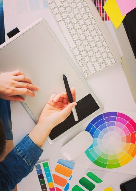
Want to know how to design? Then you should learn the basics of design. The basic elements of design include colour, line, shape, scale, space, texture and value, and these are the fundamental pieces that make up any piece of work.
If you ever start a design course this will be the very first thing that you are taught, guaranteed. Then this is the guide for you to enhance your design skills.
- Colour
Colour has a huge impact on the mood of the design. A predominantly red colour usually represents strong emotions, love, anger, passion, while blue can make the design feel calm, cool and peaceful. Color contributes to the unity of a series of flyers, emphasizes important information and leads the eye through a design. - Line
Are your lines straight and slim, or thick and squiggly? The quality of the line can say a lot about the mood you are setting with your design. - Shape
Did you know that shapes can convey a mood just like any other element of design? Angular shapes like squares and triangles tend to indicate masculinity, while smooth and curving shapes like circles are more feminine. - Scale and Size
Just for reference, size is the actual dimensions of an element on the page, scale is the element’s relation to its original and proportion is the relation of all the elements on the page in terms of size and scale. - Space
Space is often referred to as white space, and gives the design some breathing room and the eye a place to rest. An ill use of space, can make the design feel crowded and claustrophobic. Too much space, however, and the design can seem unfinished, like it’s missing something. Once you know the rules, you can also experiment with breaking them in order to push a different emotional response. - Texture
Texture is a fun element to experiment with and use to bring realism to your designs. It can be effectively used to add visual interest and it really helps make a design unique. Textures are not just applied in the computer; you can take into consideration the materials used in the final printed pieces, too. - Value
Value can really add unity to your designs if you pay attention to this neglected element. It is also a great way to create a focal point and guide the viewer’s eye through the layout.
Source : https://justcreative.com/2008/06/13/how-to-design-learn-the-basics/#


Recent Comments